Visitors form an opinion of a web page in a fraction of a second, and colour is among the first things they notice. Long before anyone reads a headline or studies a logo, the palette has already suggested whether a business feels calm or lively, and whether it seems established or new.
That is the appeal of colour psychology: the study of how colours influence how people feel and behave. It can be a helpful guide when you are choosing a palette for a website or a piece of print, as long as it is used with a realistic sense of what the research does and does not show.
What the research actually says
Colour psychology has a reputation for tidy rules, such as blue builds trust and red creates urgency. The reality is more nuanced. Researchers describe colour effects as shaped by context, culture, product category and individual differences, which means the same shade can send quite different signals in different situations.
One often-quoted test reported a 21 per cent rise in conversions after a call to action button changed colour. Results like that are genuine for the site that ran the test, yet critics point out that no solid body of evidence shows any single colour change lifting conversions by a fixed amount everywhere. A more useful way to think about it is that colour sets expectations, and the best results come when those expectations match what your business really offers.
Match your colours to your brand personality
The best-supported finding concerns brand personality. Research by Labrecque and Milne found a strong link between the colours a brand uses and the way consumers perceive it, with red associated with excitement and blue with competence.
In practice, a family-run restaurant in Altea might lean towards warm reds and oranges to suggest hospitality and energy, while an accountancy practice might favour deep blues to suggest reliability. Both choices work because they fit the business, which tends to matter more than following whatever is traditional in a particular industry.
Let neutral tones do the heavy lifting
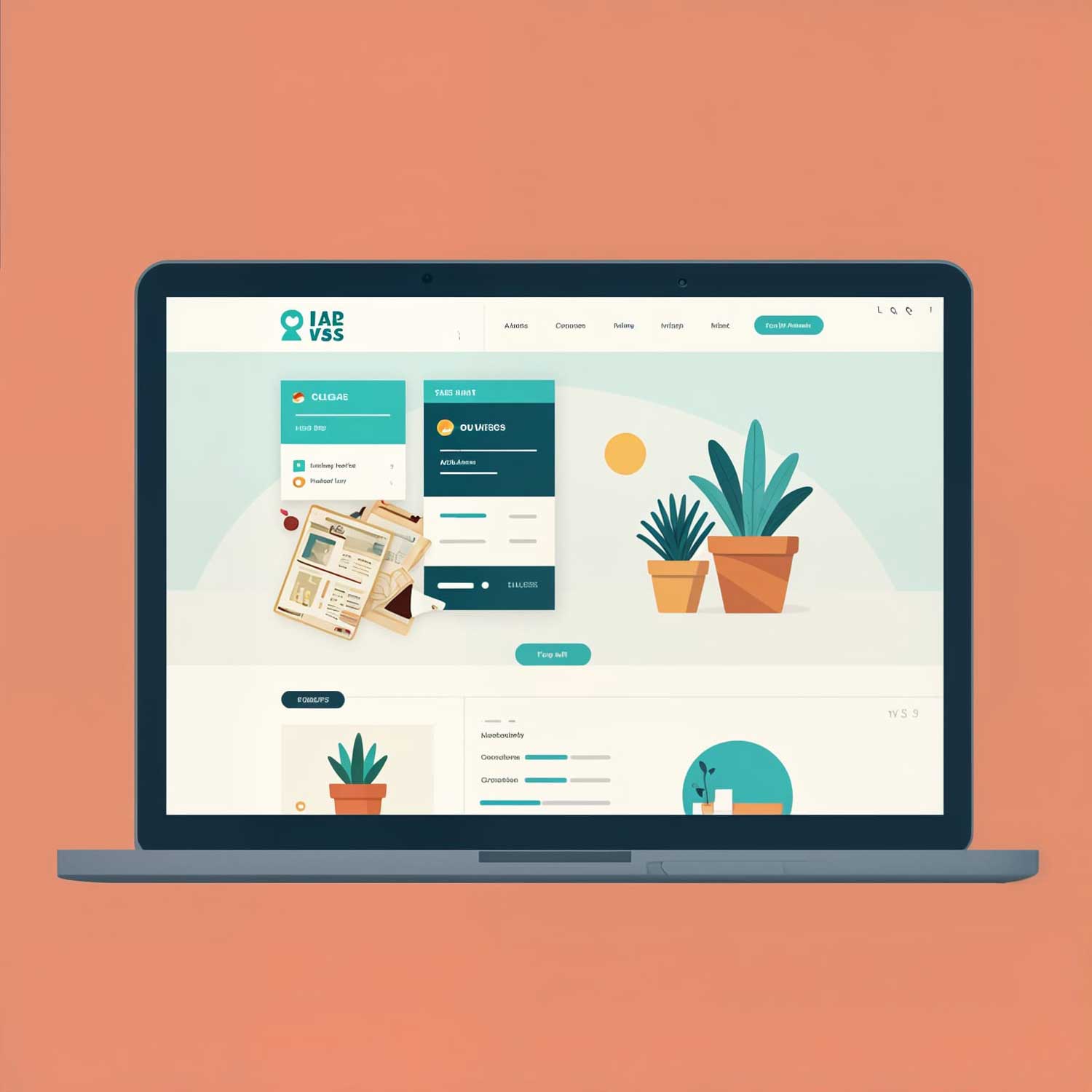
On most well-designed websites, neutral tones such as off-white and soft grey make up the majority of the surface, and they are what keep the text readable and the layout tidy. Your brand colours then do their best work in small doses. A single accent colour reserved for buttons and key links tells visitors where to click, and it only does that job if nothing else on the page is competing with it.
Think about culture and audience
Colour meanings travel less well than most charts suggest. White reads as clean and fresh in many Western settings, yet it is associated with mourning in several East Asian cultures. Age and background can shape colour preferences as well.
For businesses on the Costa Blanca, where customers arrive from many countries, it helps to consider who actually uses your site. A palette that feels welcoming to a local audience may land differently with visitors from elsewhere in Europe, so a little thought about your main customers is time well spent.
Keep web and graphic design in step
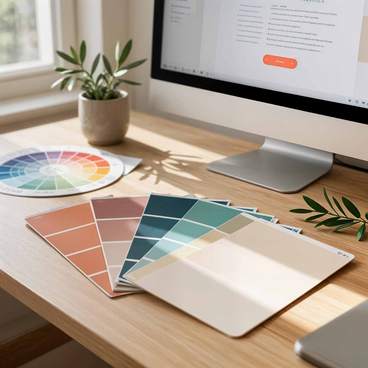
Colour behaves differently on screen and on paper. Screens mix light, while print mixes ink, so a vivid blue on a monitor can look noticeably duller on a printed brochure. Choosing your palette with both in mind, and keeping a record of the exact values for each, helps your logo and your wider branding stay recognisable wherever people meet them.
Make sure everyone can read it
A palette that pleases the eye also has to be readable. The Web Content Accessibility Guidelines ask for a contrast ratio of at least 4.5 to 1 between normal text and its background, and 3 to 1 for large text. Light grey text on a white background is a common culprit, with a typical example of around 2.8 to 1 falling well short.
This matters for a larger group than many people expect. Roughly 1 in 12 men and 1 in 200 women have some form of colour vision deficiency, most often difficulty telling red from green. For that reason, colour should never be the only signal on a page. A form error shown only in red will be missed by some visitors, so pairing it with a short message or an icon makes it clear to everyone. Free tools such as the WebAIM Contrast Checker will give you a pass or fail result in seconds.
Test, then trust your own results
Because the evidence depends so much on context, your own audience is the most reliable guide. Change one element at a time, such as the colour of your main button, and track click rates and enquiries over a few weeks before deciding what to keep. Small, measured adjustments will tell you far more than any general colour chart.
Bringing it together
Colour psychology works best as a starting point for a conversation about who you want to reach and how you would like them to feel when they arrive. If you would like help choosing a palette for a new website, a refreshed logo or printed materials that match, you are very welcome to get in touch through our contact page.