You've spent time building your website. You know where everything is, how it all fits together, and why each page exists. But here's the thing, your visitors don't have any of that context. They arrive with fresh eyes, a very short attention span, and an almost unconscious checklist running in the background before they've even read a word.
Understanding what customers actually notice first, not what we think they notice, can be the difference between a website that wins business and one that quietly loses it.
It All Comes Down to the First Few Seconds
Research consistently shows that visitors form a first impression of a website within a fraction of a second. Not a few minutes. Not a few seconds. A fraction of one. That gut reaction happens before anyone has consciously processed a single element on the page.
After that, you have roughly 8 to 10 seconds before a visitor decides whether to stay or leave. So what exactly is catching their attention during that window?
1. Visual Design and Overall Appearance
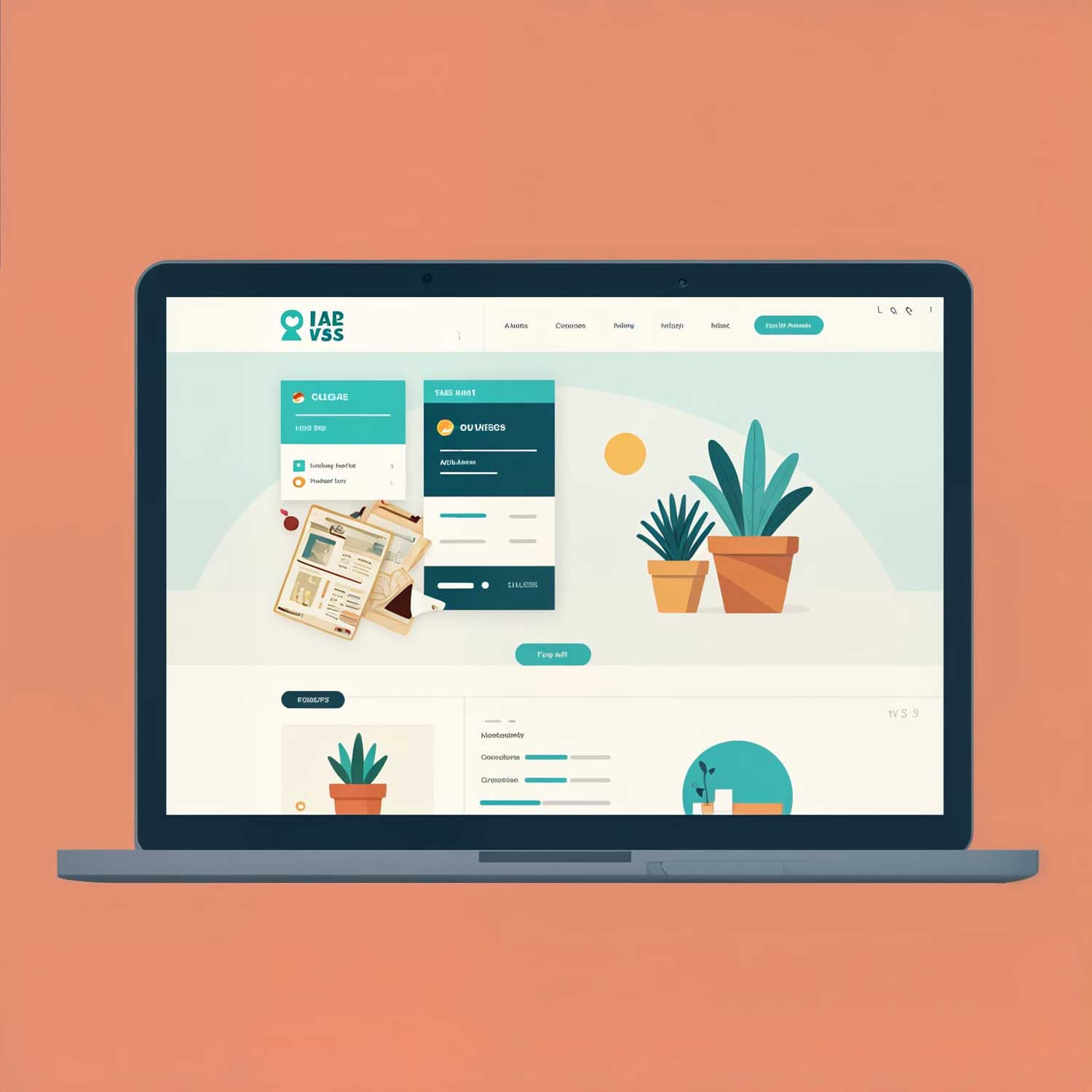
The first thing anyone notices is how the site looks. Is it clean or cluttered? Does it feel modern or dated? Is there a clear sense of who this business is?
A website that looks professional immediately signals that the business behind it is serious and trustworthy. One that looks outdated or amateurish does the opposite, and no amount of good content further down the page will fully recover from that initial stumble.
This doesn't mean your site needs to be flashy or expensive. It means it needs to look intentional. Clear fonts, consistent colours, quality imagery, and breathing room (that's web designer speak for adequate white space) all contribute to a visual impression that says: this business knows what it's doing.
2. Load Speed
This one is brutally simple: if your site is slow, people leave. Studies put the tipping point at around three seconds; after that, a significant proportion of visitors abandon the page entirely. And they don't come back.
Speed isn't just a technical detail; it's a first impression in its own right. A sluggish website feels unreliable. It makes visitors wonder whether the business itself is equally unresponsive. A fast website, by contrast, feels sharp and professional before a single image has fully loaded.
If your site hasn't been optimised for speed recently, including image compression, caching, and a reliable hosting provider, it's worth prioritising. It's one of the highest-return improvements you can make.
3. Whether It Works on Mobile
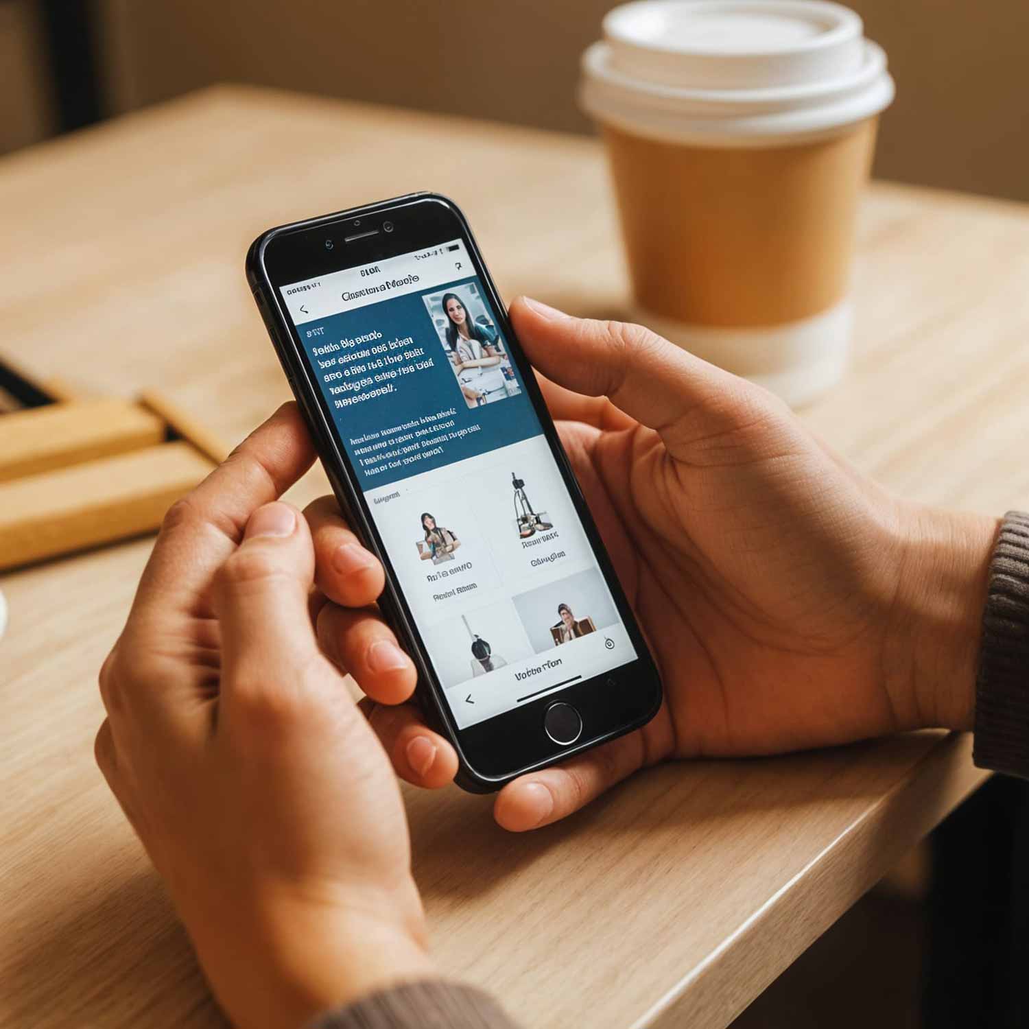
More than half of all web traffic now comes from mobile devices. For many local businesses targeting customers in their area, that figure is even higher. If your site isn't mobile-friendly, if visitors have to pinch, zoom, and squint to read it on their phone, you've lost them almost immediately.
This isn't just about the site scaling to fit a smaller screen. It's about the entire experience feeling natural on mobile: text that's readable without zooming, buttons that are easy to tap, navigation that doesn't require microscopic precision. A site that works beautifully on a desktop but frustrates on a phone is, for most businesses today, a site that doesn't really work.
4. The Hero Section: What You Do and Who You're For
Assuming your site loads quickly and looks the part, the first thing visitors try to understand is: what is this place, and is it relevant to me?
The hero section, which is the area at the top of your homepage, usually the first thing visible without scrolling, needs to answer that question immediately.
"We help small businesses in Alicante build websites that win customers" is a better hero headline than "Your Digital Future Starts Here." The second sounds polished; the first actually tells people something. Visitors who recognise themselves in your messaging will stay. Those who can't immediately work out whether you're relevant to them will leave, often without realising why.
5. Navigation and Ease of Finding Things
Once visitors decide they're in the right place, the next test is whether they can find what they came for. Clear, simple navigation is one of those things that users never consciously praise but immediately notice when it's missing.
If your menu is buried, confusing, or crammed with too many options, visitors feel lost. And a lost visitor is a leaving visitor. Aim for a small number of clearly labelled menu items, a logical page structure, and a site that doesn't require prior knowledge of your business to navigate effectively.
6. Trust Signals
Visitors are cautious, especially on sites they haven't encountered before. They're looking, often subconsciously, for signals that you're a real, credible business. These trust signals include:
- A professional logo — it sounds basic, but a polished logo makes a disproportionate difference to perceived credibility
- Real photography — genuine photos of your team, your premises, or your work will always outperform generic stock images
- Testimonials and reviews — social proof is enormously powerful; a handful of genuine reviews from real customers does more work than a hundred carefully crafted marketing claims
- Clear contact details — a phone number, an email address, or a physical address signals that there's a real business behind the website, not just a landing page
- An SSL certificate — that padlock in the browser bar is noticed (and its absence is noticed even more)
7. The Call to Action
Every website should make it obvious what you want visitors to do next. Book a call. Request a quote. Browse the portfolio. Get in touch. If visitors have to hunt for a way to take the next step, many simply won't bother.
Your primary call to action should be visible early on the page, repeated at sensible intervals, and worded in a way that makes the next step feel easy and low-risk. "Get a free, no-obligation quote" is a more reassuring invitation than "Submit your details."
Putting It All Together
None of these elements work in isolation. A beautifully designed site with a slow load time will still lose visitors. A fast, mobile-friendly site with a confusing homepage won't convert. The businesses that consistently win online are the ones that get all of these basics right.
The encouraging news? Most of these things are fixable. A website audit, a redesign, better hosting, clearer messaging, these aren't enormous undertakings, and the impact on how customers perceive your business can be immediate and significant.
Final Thought
Your website is usually the first real impression a potential customer gets of your business. Before they've spoken to you, before they've read your reviews, before they've compared you to anyone else, they've already formed a view based on what they saw in those first few seconds.
Make those seconds count.